
Case study · Data
Spreadsheet Dashboard.
A clear dashboard built from a spreadsheet
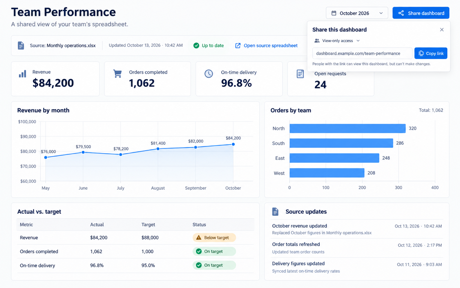
We turned a team's spreadsheet into a clear, shareable dashboard — the same numbers, laid out well, refreshed whenever they updated the sheet.
Start your project →- Industry
- Data & analytics
- What we built
- 3 integrated components
- Key outcome
- 1 link Instead of screenshots
Overview
Giving the spreadsheet a face.
A team ran on a spreadsheet, but reading it meant scrolling columns, and sharing it meant emailing screenshots that were out of date by the afternoon.
They wanted a clear dashboard anyone could open — without a data project or new systems.
- Numbers trapped in a spreadsheet nobody enjoyed reading
- Screenshots that were stale as soon as they were sent
- No clear, shareable view of how things were going
- No appetite for a big BI tool or data pipeline
The goal was a simple, shared dashboard that reflected the spreadsheet whenever it changed.
Experience flow
From a spreadsheet to a shared view.
The solution
A dashboard built on your own spreadsheet.
We built a shared dashboard that reads from the team's spreadsheet or exports — charts, tables, and filtering, refreshed when they update the source.
Core components
Connect the sheet, lay out the numbers, and make it easy to share.
-
01
Spreadsheet connection
Source
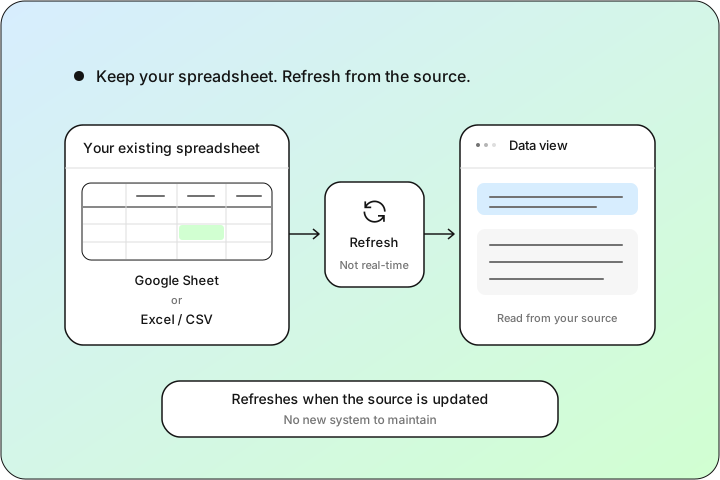
Reads from the team's Google Sheet or Excel/CSV
Refreshes when the source is updated — not real-time
No new system to maintain
-
02
Charts, tables, filtering
View
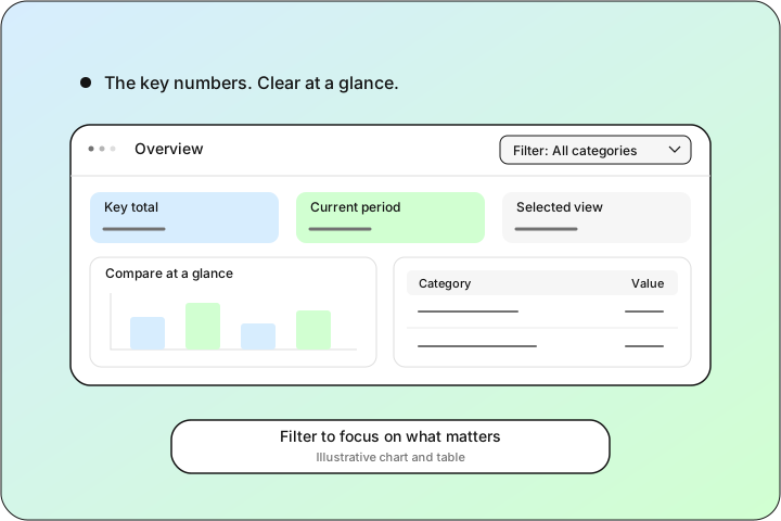
The key numbers as clear charts and tables
Basic filtering to focus on what matters
A layout anyone can read at a glance
-
03
Share & export
Share
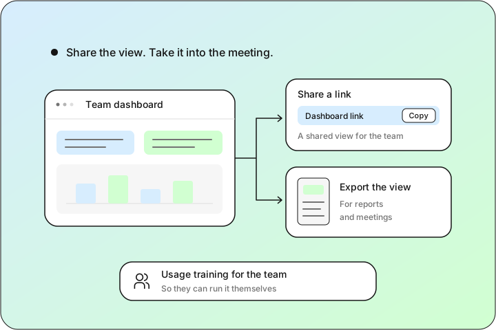
A shared link instead of emailed screenshots
Export for reports and meetings
Usage training so the team can run it
Stack used
- Next.js
- TypeScript
- Node.js
- PostgreSQL
- Prisma
Implementation approach
Phased delivery.
-
01
Map the spreadsheet
Worked out which numbers mattered and how the team wanted to see them.
-
02
Build the dashboard
Connected the sheet, built the charts, tables, and filtering, and set up refresh on update.
-
03
Share and train
Set up sharing and export, and trained the team to run and tweak it.
Results
Outcomes at a glance.
- Spreadsheet-backed
- Shareable
- Refreshed on update
'The Sheet' had its own mythology — who could edit it, which tab was real, why the totals disagreed. Now there's a link: same numbers, current, readable on any screen, and meetings argue about the decision instead of whose version is right. Exports for the monthly review take a minute instead of an afternoon of cropping screenshots. Nothing moved, no new system, no pipeline — it still lives in the same file. It just finally has a face.
- Turned a hard-to-read sheet into a clear, shared view
- Replaced stale screenshots with a link that's current on update
- Made exporting for reports and meetings trivial
- Needed no new systems or data pipeline
Impact & outcome
The same numbers, finally readable.
We gave a team a dashboard they'd actually open — the same spreadsheet numbers, laid out well, refreshed whenever they updated the source.
It wasn't real-time and didn't need to be. Honest refresh-on-update beat a complex pipeline the team didn't need yet.
It also set a foundation: when they outgrow the spreadsheet, the same dashboard can point at live sources instead.
Numbers stuck in a spreadsheet?
We turn spreadsheets into clear, shareable dashboards — refreshed when you update the source, live in weeks. We'll reply within one business day — no pressure, no sales script.
Start your project →